Let's face it, big data means lots of points.
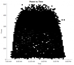
On the rare occasion when JMP creates a graph that displays large areas of dense data, consider using the transparency setting to decrease the saturation of the individual points.

In my latest "Have You Tried" video (1:22), you can learn how to use the transparency setting to lighten the points.
[iframe title="YouTube video player" width="560" height="315" src="http://www.youtube.com/embed/O1dJ3iWoMkE" frameborder="0" allowfullscreen]
