Last month, I submitted an entry to Stephen Few's dashboard competition. He supplied data for one teacher's class and asked for a dashboard that the teacher could use to "rapidly and effectively monitor the performance of her students for the purpose of helping them improve their mathematics skills." I think my entry missed the mark by being more of an analytical dashboard instead of a descriptive dashboard.
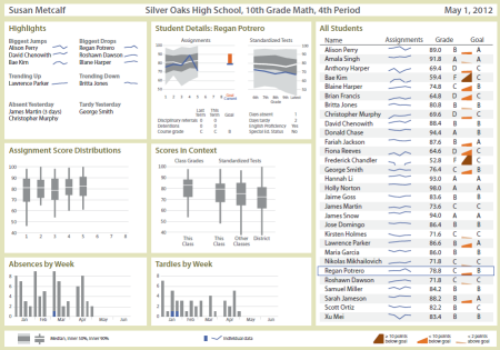
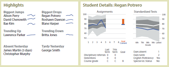
The winning entries took the latter approach by featuring a giant table containing all the data. (You'll find many other entries in Stephen Few's discussion forums.) I do have a student table along the right side, for look-up of common items (answering "What's my grade?" questions). But the prime real estate in the upper left is for some analytical highlights, and next to that are details for a selected student.
In the student table, I tried a small "wedge" graph to represent how each student is doing toward their goal. But based on comments, I'm not sure it worked so well.
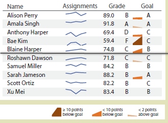
It's a small area chart plotting current grade to goal grade with the idea is that a student whose grade is below goal has an uphill journey ahead, but some read the upward line as a good thing.
You may notice that my entry doesn't look a lot like JMP output. I performed all the table manipulations, analysis, tabulating and graph building in JMP, but used Adobe Illustrator for final assembly and styling. I was pleasantly surprised how well all the components translated in a way that Illustrator could recognize the structures for further editing. Here is the original Graph Builder view of the sparklines, for example.
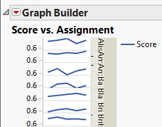
After copying into Illustrator, I removed all but the lines and sized it to fit into the table that I had already copied in from Tabulate. The dashboard was a great exercise. I found ways where JMP can do better for making this kind of view and was pleased at how well JMP served to create all the parts.
Kun wrote:
Xan,
I look forward to seeing your "making of"post. Thanks, Kun
Xan Gregg wrote:
Thanks, Walt. There wasn't really any JSL, unless you count a few formula columns for the current vs. goal plots. If there is enough interest, I could work on a "making of" post, if that's what you mean.
Walter Paczkowski wrote:
This is very interesting. Could you share the JSL code and a demo so we can see more than just a small screenshot?
Thanks,
Walt
I'd like to see more details on a post of this too!
