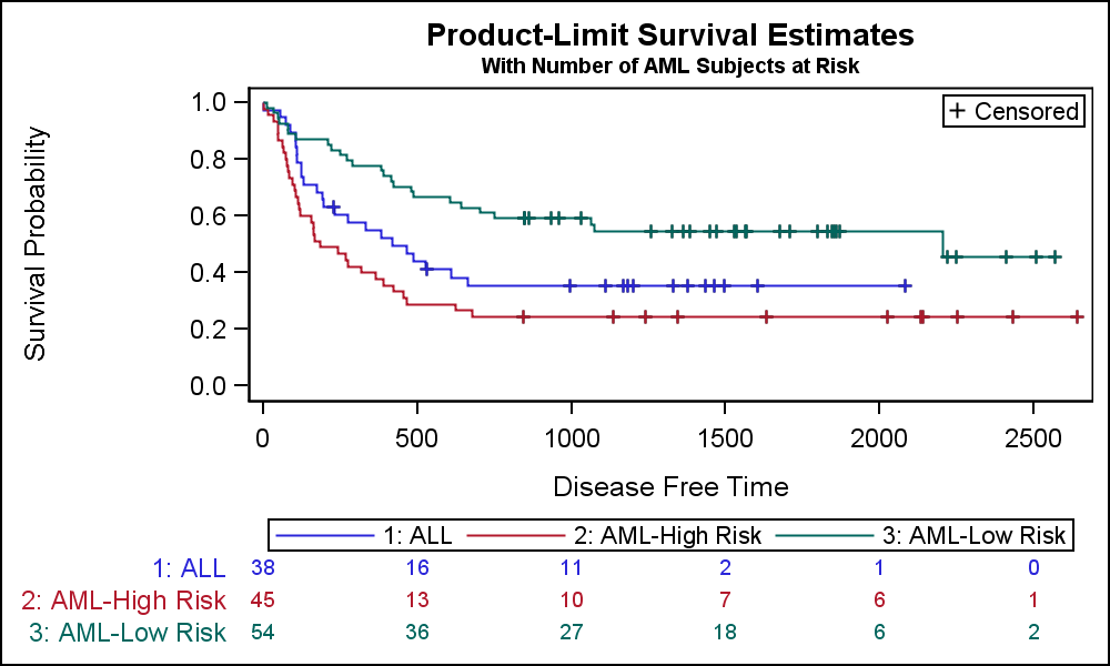
Hi I am wondering how I can get a Kaplan Meier plot with the corresponding at risk tables displayed underneath?
Thank you.
Select Analyze > Reliability and Survival > Life Distribution. Enter your time to event variable in the Time role and click OK. Click the red triangle when the platform opens and deselect Show Points. The table is initially closed but it appears directly below the probability plot.
How do I get a graph looking like this? I would like the at risk numbers displayed below the Kaplan Meier table. Thank you.
Try Analyze > Reliability and Survival > Survival with the life time data column in the Y, Time to Event role, the censoring indication data column (if there is one) in the Censor role, and the group membership data column in the Grouping role. Here is an example:
Click OK and you will see the desired plot at the top of the window:
I do not understand the 'at risk table' that you show. I do not think that JMP provides this table directly but it can probably be obtained with a summary action on the estimates.
You can obtain the estimates by opening the outline at the bottom of the window for any group or the combined observations. For example, here is Group=1 estimates:
The original suggestion of using the Life Distribution platform with the Compare Groups tab might also work.
Journals frequently require survival plots to be formatted as in the example at the top (eg https://jamanetwork.com/journals/jamaoncology/pages/instructions-for-authors). I've put that in my JMP wishlist to have this as an option. The closest I can get at the moment is to append a table box with the relevant numbers, but I can't quite get the table size to align with the survival plot, but it's close enough to edit it further in the Journal. I would be grateful for any suggestions how to improve this or if there is an Addin that makes this happen. I've thought that maybe the graphbuilder could be used to create this plot ( cf forest plot addin @Richard_Zink)
dt = Open( "$SAMPLE_DATA/Rats.jmp" );
minT = 100;
maxT = 350;
stepT = 50;

Summarize( lv = by( :Group ) );
obj = Survival(
	Y( :days ),
	Censor( :Censor ),
	Grouping( :Group ),
	Show Points( 1 ),
	SendToReport( Dispatch( {"Survival Plot"}, "1", ScaleBox, {Min( minT ), Max( maxT ), Inc( stepT ), Minor Ticks( 1 )} ), )
) << report;

obj[List Box( 2 )] << append( Table Box( String Col Box( "No at Risk | Day", lv ) ) );
Tab1 = (obj[lv[1]][Table Box( 1 )] << get);
Tab2 = (obj[lv[2]][Table Box( 1 )] << get);
For( T = minT, T <= maxT, T += stepT,
	lp = Max( Loc( Matrix( Tab1["days"] ) <= T ) );
	AR1 = Tab1["At Risk"][lp];
	lp = Max( Loc( Matrix( Tab2["days"] ) <= T ) );
	AR2 = Tab2["At Risk"][lp];
	obj[List Box( 2 )][Table Box( 1 )] << append( Number Col Box( Char( T ), {AR1, AR2} ) );
);
Hi I guess you want to create something like this:
You can get this, by following this procedure:
As you will get all the AtRisk Values displayed, you may want to add columns for the required days, e.g. 150, 200, 250, 300, 350 and copy the values of the row with the closest smaller day number into the line respectively. Then use just these as labels. Not sure if this will be very easy compared to a script, but you should get at least close to what you want.
However, a combined window of the survival plot (in the survival platform or in Graph Builder) plus a table created with tabular or summarize, then tabular, will work in a similar fashion.
@ghartel , you mentioned a wish list entry. I cannot find it. Would be great if you could post the link to the entry here, so anyone interested in this can give a kudo to your wish.