This is a continuation of a series of blog posts on interactive HTML for Graph Builder reports in JMP 13. Here, I'm discussing support for Points, Box Plots, Heat Maps and Map Shapes. These Graph Builder elements are highlighted in the figure below.
 Since this blog post describes interactive web pages output from JMP, images and animations below were captured from a web browser.
Points
Points exist in many graphs in JMP where you can customize the point color, shape, and size, usually by opening a dialog box. Graph Builder’s drag-and-drop interface makes it easy to create colorful graphs with points of all shapes and sizes. The example below using Diamonds Data from the sample data library in JMP sets the following point attributes:
- Size based on the Table column data
- Color based on the Depth column data
- Shape based on the Clarity column data
In addition to these attributes, Price versus Cut and grouping by Carat Weight was employed to understand what influences diamond prices the most. Of course, JMP provides capabilities that specifically target this question, but that’s a topic for another blog post.
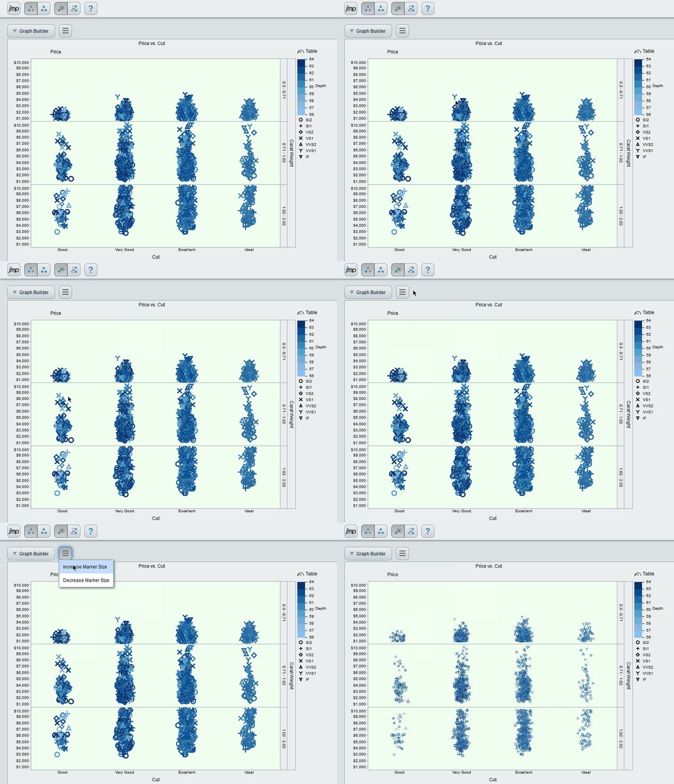 This combination of attributes made supporting Graph Builder point plots in Interactive HTML challenging because there are now more ways to determine the size, shape and color of each point. The challenge was increased additionally by the fact that each point in Graph Builder can represent a statistical summary of multiple rows of data.
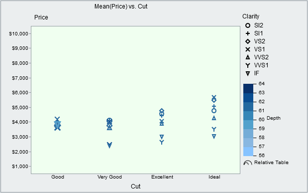
In the following Interactive HTML example, each point represents diamonds of a given Cut and Clarity. Although the legend is rearranged, the shape and color are still determined by Clarity and Depth respectively. To accentuate the difference between the diamonds' Table dimensions, a column transform named Relative Table was used in the Size role rather than the raw Table column data.
 Box Plots
The summarized points above may provide too little information and the raw points may be too busy, so how about a compromise using box plots? In the graph below, we see the distribution of prices for each Cut, Clarity, and Carat Weight combination. The legend was moved to the bottom and drawn horizontally to match the arrangement of box plots in each group.
 Heat Maps
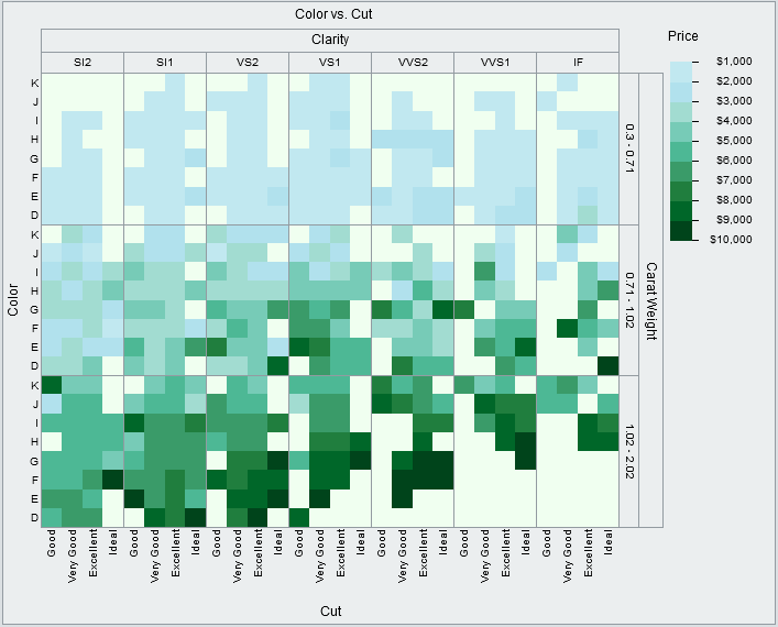
So far, it might be difficult to see what influences diamond prices the most. We’ve only covered three of the four C’s in diamond quality. So, here’s a heat map including all four. Maybe now it’s easier to make some conclusions.
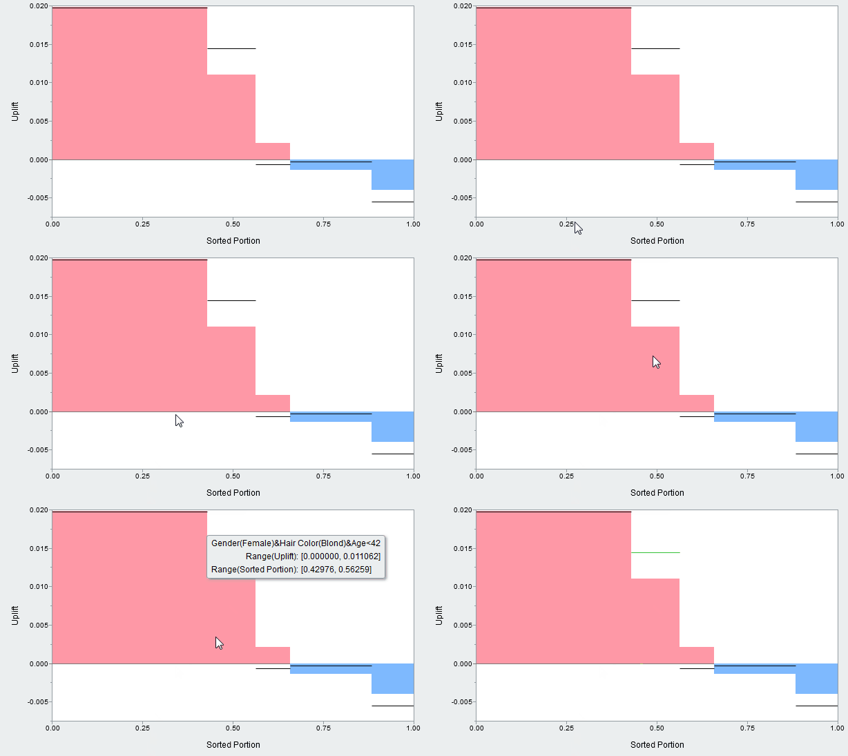
 Adding support for heat maps in Graph Builder gave us a bonus outside of Graph Builder: The Uplift graph in the Uplift Platform is now interactive and can display X Factors and X/Y ranges.
 Map Shapes
Map shapes can be used in Graph Builder for location-based data, like population data. Grouping can help the viewer focus on one region at a time. With the ‘Show Missing Shapes’ option enabled, the region of interest can be seen in context of the whole country.
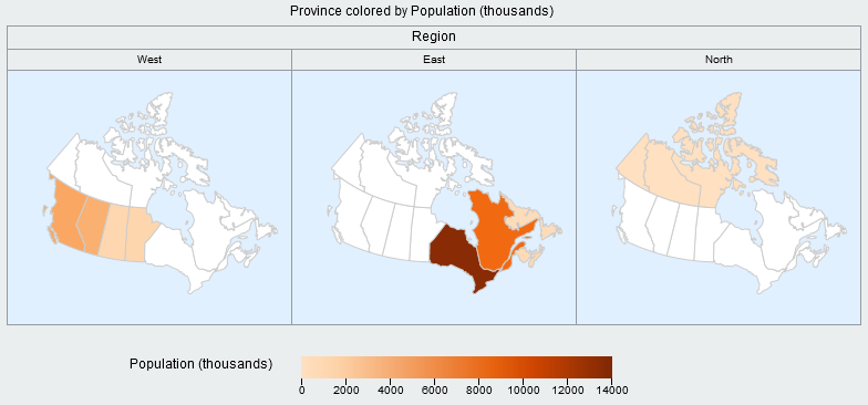 Map Shapes can be scaled according to a size variable (Population) while being colored by another variable (Vegetable Consumption).
 Combinations
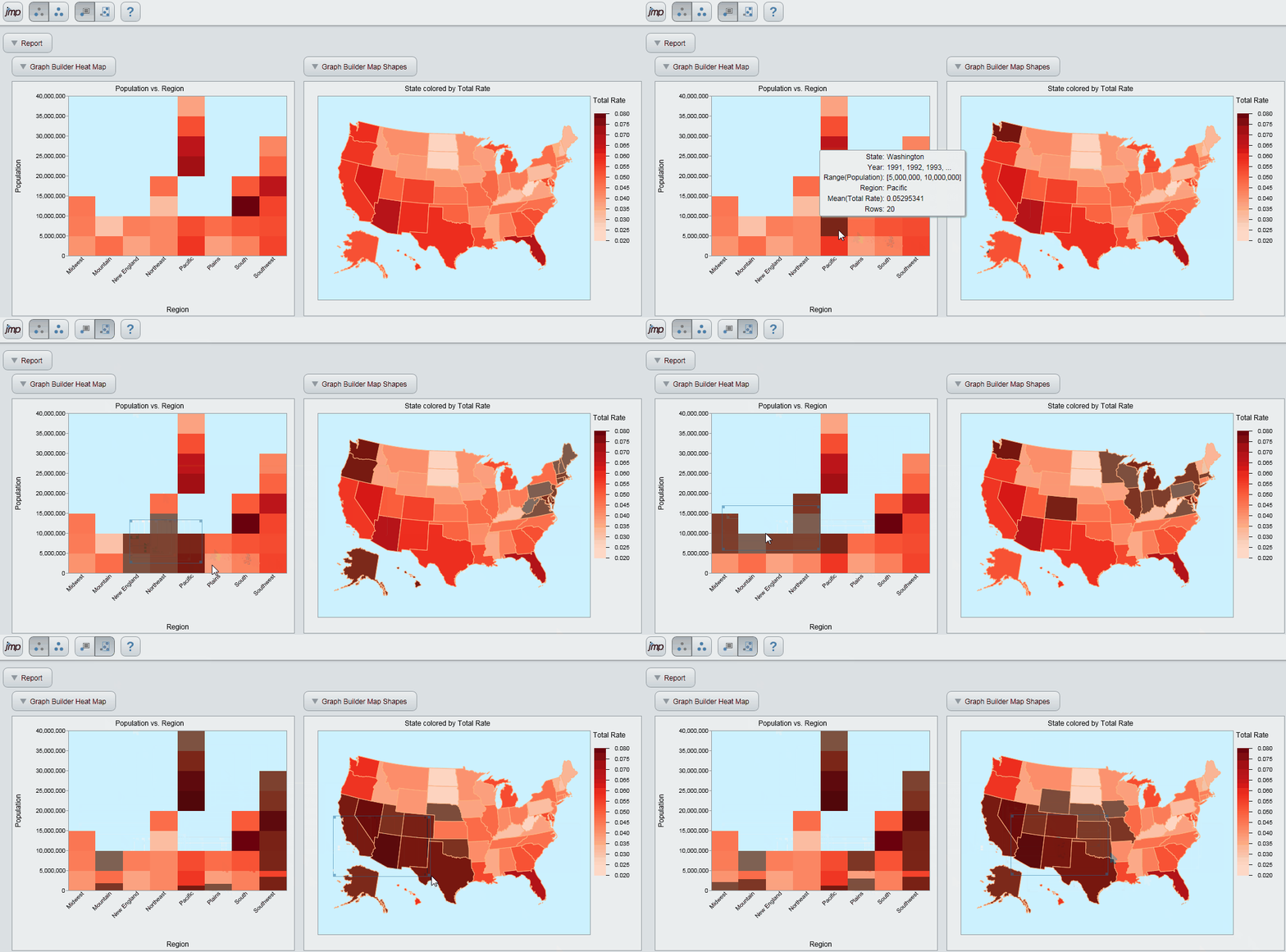
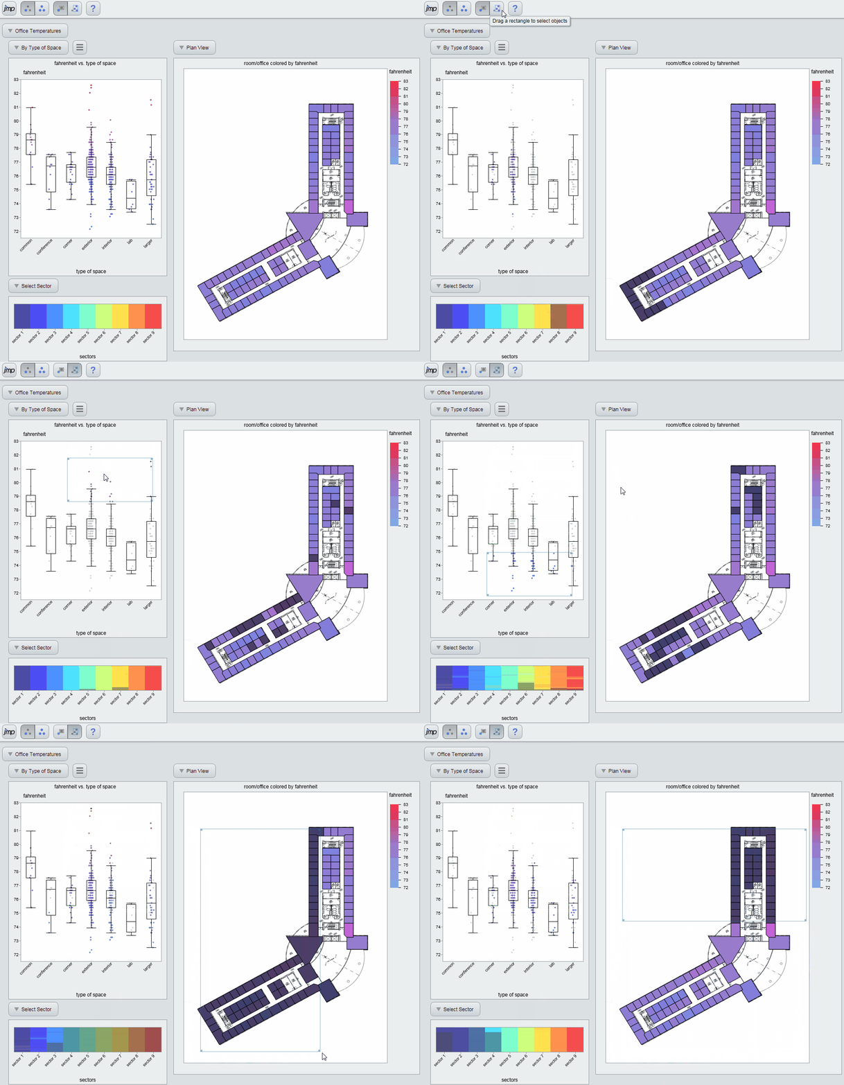
To see that some of the interactive power of JMP is available in Interactive HTML, it helps to interact with combined graphs. In JMP, this can be accomplished with Combined Windows, Application Builder, or Dashboard Builder. Below are some combination examples using the graph types described above.
This example explores Crime data with a Heat Map and geographical Map Shapes.
 The following example uses Points, Box Plots, a Heat Map, and a custom Map Shape to explore office temperatures.
 One new feature for Points and Map Shapes in Interactive HTML is the ability to display images in tooltips.
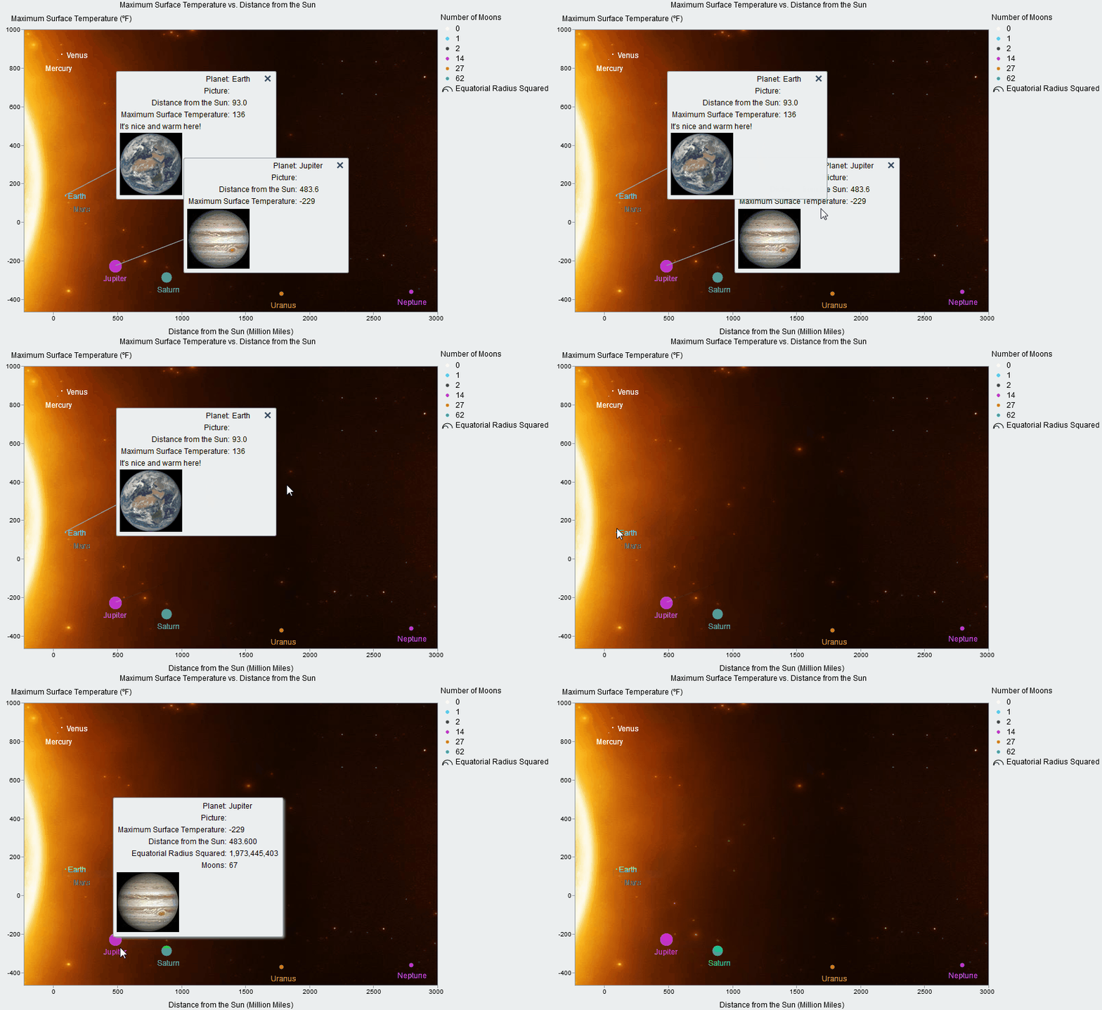 Note that these are all just animations. You can interact with the Interactive HTML files shown in this blog at a page we created for this purpose. Let us know what you think!

