On the next Analytically Speaking, we’ll hear from Xan Gregg, JMP Director of R&D and the creator of the drag-and-drop Graph Builder. Here is a preview of what he’ll discuss. Tune in Wednesday, March 16, at 1 pm ET to hear the rest.
Q: Tell us about the importance of graphs and visualizing data.
A: Earlier in my career, I could see how valuable data visualization was, but didn’t really understand why until I started studying perception and how the mind works. There is a big part of the mind just dedicated to visual processing, making a very efficient way of getting information into our minds.
There’s a famous example, Anscombe’s Quartet. It has four different data sets, and if you look at just numbers on a table, they look the same. And if you look at the summary stats, they are the same. But when you see the points themselves on the scatterplot, you can immediately see they are all different.
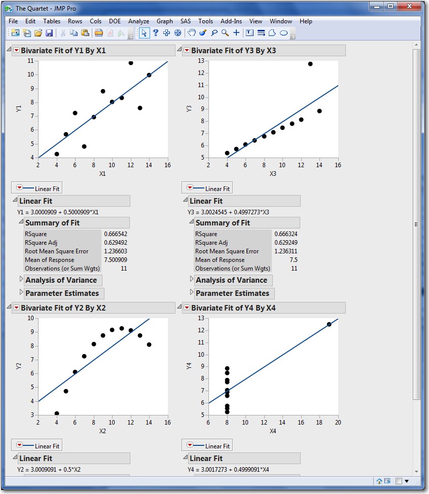
Anscombe's Quartet: When you see the points themselves on the scatterplot, you can immediately see the four data sets are all different.
That’s the power of visualization, just in that simple example. It extends, as well, to the more elaborate graphics that we have today.
Q: What’s your perspective on different data visualization terminology?
A: The terminology is sometimes fuzzy. For instance, “data visualization” versus “information visualization” or “descriptive” versus “analytical” depends on your point of view. But I think the terms point out a spectrum of purposes of data visualization. Sometimes we’re looking at the raw data, especially as we’re using JMP for exploration and discovery. We just want to see what’s in the data and get a description of it. But other times, when we’ve found something and we want to make a point; that’s when we use an information visualization to communicate the analysis results.
And even with the same data, you have a choice of how you visualize it, and that changes the information. If you have a series of data points and you look at it as bars, then the information that you’re communicating is that these are discrete values. But if you look at it as a connected line, you’re communicating that this is a sequence and you’re focusing on the change. Whereas, if you use a smoother instead, you’re focusing on the long-term trend.
So even with the same data, there’s a chance to communicate different information based on how you visualize it. We have a choice of visualizations. It’s not to say one is right and one is wrong. They each communicate a different message.
Q: Why are some graphs less useful than others?
A: They can be less useful because we can put too many things in the graph. We add extra labels, tick marks, colors, dimensions, and those may not be in the data. Or even if they are in the data, sometimes they still distract from the actual information that we want to communicate.
And the other way they can be less useful is by not being in line with our senses. There are some things we can perceive more accurately than others. There are some things we perceive categorically rather than continuously. So we need to make sure we align categorical visual perception with categorical data and the same for continuous.

