It is always nice to show your data analysis results from JMP directly in JMP. But in some cases, you may need to prepare a slide deck to present your information to others. Since I am primarily a Mac user, my favorite software for creating presentations is Keynote from Apple.
In this post, I’ll show the way I prepare my JMP graphs for Keynote slides, and a workflow that makes it painless to get graphs and tables from JMP to Keynote slides.
No matter how compelling your findings or data are, much of your message will be lost if the images on your slides are not high-quality, vector images. This is especially true as more and more projectors are capability of rendering very high-resolution, wide-screen images.
If you read my previous post on producing publication-quality graphics on the Mac, you’ll find that I am using largely the same workflow when I want to get my images into Keynote.
So let’s get started. Before we get into my actual workflow, though, let’s look at a potential pitfall when trying to directly copy and paste graphics from JMP into Keynote.
For this example, I am using the Iris data set, which is included in the sample data directory in JMP. I’ve run the discriminant analysis script in the data table, which has created the following JMP report that I aim to put into a Keynote slide.

So let’s see what happens if we try to copy and paste. I’ll use the selection tool (select the fat plus from the tools menu or use keyboard shortcut ‘S’). I’ll select the Canonical Plot and Score Summaries tables, and then copy (Command-C) and paste (Command-V) into Keynote.
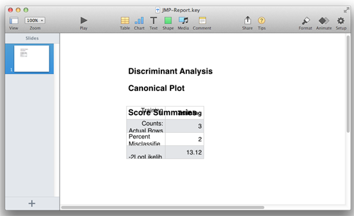
Not exactly the desired result! But let’s unpack what’s happening. Keynote is smart enough to try to understand what I am trying to do – in this case it knows that there is a table on the clipboard and has tried to create a table in Keynote, where the cells can be edited (very nice, but not really what we want in this case). And also, we’ve lost the graph in the process.
I’m going to suggest an alternative way of getting graphics into Keynote. This method takes only a few seconds more than a direct copy/paste, but it almost always achieves a predictable result and allows very high-quality vector PDF graphics to be placed in slides. And, you’ll be able to resize these graphics without any loss of quality or clarity.
Let’s try this again.
I’ll select the Canonical Plot and Score Summaries table again and copy them. But instead of going directly to Keynote, I am going to open Apple’s Preview application and then select New from Clipboard or type Command-N.
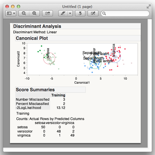
That’s more like it! I can now save this as a Vector PDF image using File > Save or typing Command-S. Now I will drag the PDF document I’ve just created into the slide of my Keynote presentation.
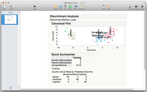
Now we have the properly formatted JMP graph on our slide. This procedure works with any JMP graph or table. You may find that outputting individual elements from a JMP report (such as a single graph or table) affords you some more flexibility in laying out your slides. That is also easy, and the process is nearly the same.
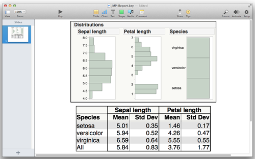
In the figure below, I’ve selected the graph from Distribution and also the results from Tabulate and placed them in the slide. The table came into the slide quite a bit smaller than the graph on the slide because of my default font size in JMP. Fortunately, because my images are Vector PDFs, I can increase the size of the table as much as I want with no loss of quality.
So that’s it! That is the procedure that has worked well for me. I’d love to hear any thoughts or comments you have on my workflow, or any tips and tricks you may have when creating slideshows in Keynote that include JMP graphs or tables.

