Bubble Plots are very popular for their ability to display many dimensions at once (X, Y, Size, Color, ID, Time). As the name suggests, a traditional Bubble Plot uses a circular shape to represent each row or aggregation of rows based on the ID(s). The radius of the circle is scaled by the square root of the Size column, ensuring that the area contained by the circle scales linearly with the value of Size.
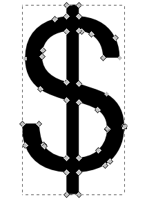 Starting with JMP 10, an option was introduced to use alternate shapes in place of a circle. Built-in shapes include Triangle, Square, Diamond and Arrow. There is also an option to set a custom shape from JSL, using the same syntax as the Path() graphics function. A poster by Rosemary Lucas and Kyoko Keener at JMP Discovery Summit 2013 used a custom bird shape to visualize the FAA Wildlife Strike Database. Custom shapes retain the linear scaling property, allowing for visual ranking of bubble sizes. Paths in JMP consist of a sequence of XY points with control information specifying whether to move, draw a line or draw a curve. Using a vector drawing program such as Inkscape, paths can be interactively created and edited, as shown in the figure to the right.
Unfortunately, the process of applying these paths to a Bubble Plot in JMP requires manual steps and JSL scripting to transfer the path from a file or vector drawing program into JMP. I recently created a JMP add-in that makes this much easier, providing a graphical interface for opening a file in SVG format, extracting the paths, using transformations to recenter and scale the shape, and applying the result to an existing Bubble Plot report. You can get my Bubble Shapes Editor add-in for free from the JMP File Exchange. (Download requires a free SAS profile.)
 After installing the add-in, open the Bubble Shape Editor from the Add-Ins menu to create the dialog shown to the left. The add-in includes several public-domain shapes (Dollar Sign, Euro, Plane, Car) downloaded from Wikimedia Commons. You can also download or create an SVG file and open the file directly from the interface. The add-in will locate all of the paths in the file and give you the choice of which one to use. The shape is automatically translated and scaled, and shown graphically with a comparison circle to demonstrate how it will look compared to the default Bubble Plot shape. You can perform additional transformations to position the shape relative to the reference circle. When you are satisfied with the look of the shape, you can select a Bubble Plot from the list on the right, and click Apply to update the plot with the new shape. In the figure below, the Dollar Sign was used to emphasize the use of Expenditure in the Size role of the plot.
 Thousands of shapes are readily available to represent nature, transportation, manufacturing, society and many other topics. In addition, you may find that your own organization has SVG shapes available with company, product or industry-specific logos. When choosing a shape and selecting a transformation, keep in mind that the viewer will attempt to compare shape sizes and estimate XY positions from the shape. While circles have good characteristics in this respect, linear or asymmetric shapes will have an effect on the perception of the viewer. In a future post, I will show how you can use another feature of the JMP Bubble Plot to allow your shape to rotate to align with the bubble trajectory. How do you think you will use custom shapes? Let me know in comments.


