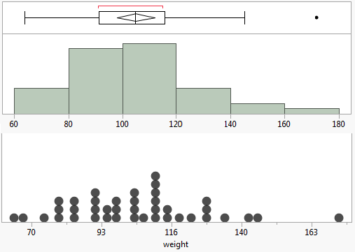
JMP has a rather straightforward distribution analysis using histograms accompanied with various statistics such as mean, standard deviation and the quantiles. But if you care about gaps in your data, whether small or large, histograms might not be your best bet. Another basic statistical tool, the dot plot, can reveal these gaps in the distribution. Here is one set of data being displayed in a histogram and dot plot.
"Dot plot" is a general term, as there are several different plots that people call dot plot. Leland Wilkinson has published a paper on a particular type of dot plot that has been used for more than 100 years. This summer, I had the opportunity to write a JMP add-in of Wilkinson's dot plot (and you can download it from the JMP File Exchange).
[Update: Shang's Dot Plot add-in is included in JMP 11 and later. It's under Help > Sample Data > Teaching Demonstrations > Dot Plot.]
The add-in has a few complementary features, like:
Automatically label dots by data.
Color dots by a categorical variable.
Size dots by a continuous variable.
Superimpose a box plot.
Dot Labeling
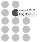
The data column is automatically labeled, so when you hover the mouse over a dot, the data value shows up. If another column is selected as the data column, then the previous data column becomes unlabeled.
Dot Color
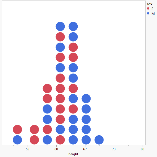
Dots can be colored by a categorical column. In the image above, the dots are colored by sex.
Dot Size
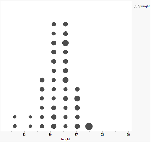
Dot size can be changed by a continuous column.
Box Plot
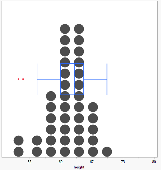
Wilkinson said, "Dot plots are especially suited for supplementing other graphics." Superimposing a box plot is another feature of the add-in.
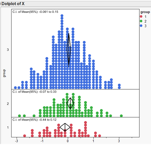
The add-in can be used as a teaching tool to demonstrate basic statistical concepts. I used JSL to create a data table with two columns and 500 rows. The first column is numeric and holds random normal numbers, while the second column is categorical and was used to separate the random normal numbers into three groups. I then displayed this data in the dot plot using the random normal column as my data column, split it by the categorical column, showed the C.I. of mean and showed the mean diamond of 95% confidence. The resulting plot effectively shows that, as sample size goes up, the confidence interval becomes smaller. With very little effort and prep work, the dot plot add-in helps teachers demonstrate basic statistics concepts, and it also lets students experience modern statistical visualization software.