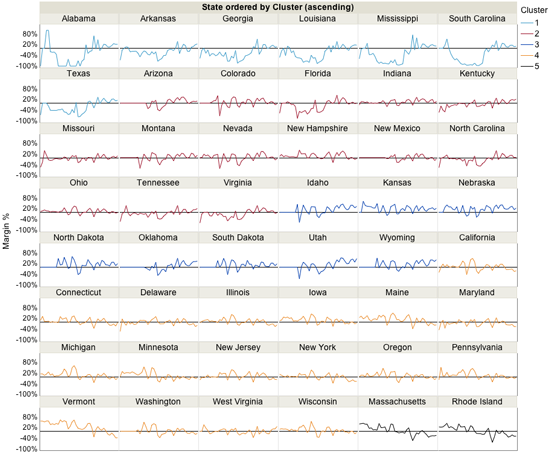
For those of you who haven’t tired of election results (can the three of you please gather around this blog post?), I came upon voting data by state from the inception of the Republican Party (1850s) to today. I thought I’d first take a look and see how each state has voted in the past.
The first thing that caught my eye was how many states, mostly in the South, had wide gaps between Democrats and Republicans, all favoring the Democratic Party until the 1940s (around WWII). Then the gap in those, and all states, tightened between the two parties.
I then wondered if today’s battleground states have always been battles. What did their history look like? I first filtered to show just those states on the trellis chart:
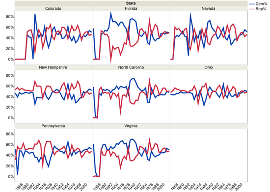
It did seem that earlier on, there were wide gaps between the winning and losing party, but all the states seemed to narrow that gap in recent history.
You can see, how over time, the margin of victory for either party narrowed significantly.
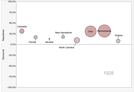
I then decided to look at each year separately. Resisting the urge to put the data on a geographical map, I chose the bubble plot instead. So here are the battleground states as they existed in 1928, shortly before the stock market crash and the Great Depression. All pretty solidly Republican.
Then the crash hit, and by 1936, they were all voting Democrat.
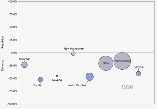
Republicans didn’t win back their hearts and votes until Dwight Eisenhower ran for office in 1952 and 1956. His status as a WWII hero propelled him into the spotlight when he was drafted by the Republican Party to run for office.
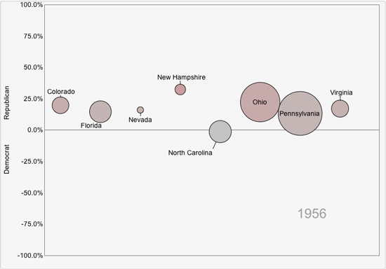
These battleground states stayed battle-free with a strong turnout for either Republican or Democrat during subsequent elections. So when did they start to become so contentious for politicians? The last election that Americans got solidly behind one candidate looks like 1988, when George H. W. Bush won the Presidency, beating Michael Dukakis.
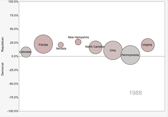
Since then, these have been tightly contested races, including the one we just witnessed.
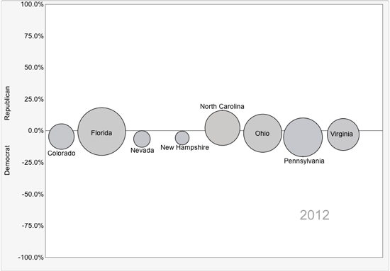
The graph below displays the data in the original trellis chart for just the aforementioned years.
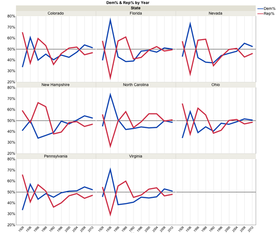
Which do you prefer? The individual bubble plot or the trellis line graph? I admit I’ve removed one of the best features of the bubble plot – motion, the ability to see how data changed over time. But even in their static form, I prefer them, for I can more easily digest the narrative with a separate visual for each election. Your thoughts? Are bubble plots less valuable when not animated?
I’ve uploaded the data table to the JMP File Exchange so that the three of you who are still interested in the election can take a look at the data table and see what you think. Let me know. (Downloading the file requires a free SAS profile.)
Addendum (Nov. 16, 2012): Here's the new bubble plot I made in response to Teresa's comment below:
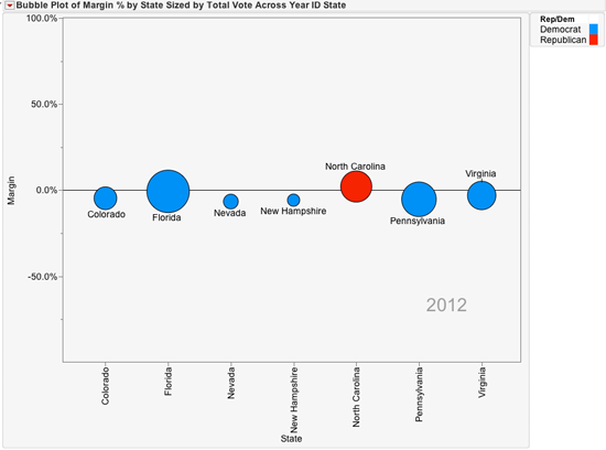
Addendum 2 (Nov. 19, 2012): Here's the cluster analysis, as suggested by Teresa.