Like many people, I've been closely following news of the European debt crisis. While no one knows what would happen if any European country actually defaults, speculation is rampant. However, I haven’t come across any visuals that adequately show the scope of the situation and how one country's default would affect the rest of Europe and the UK. I decided to use JMP to see whether data visualization would help me understand the debt crisis better, and I did find it useful.
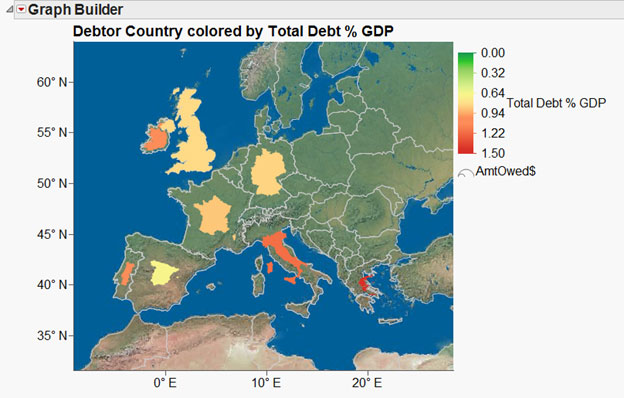
I started by looking at the crisis from the debtor country perspective. The map below shows the countries, colored by the size of their debt relative to their Gross Domestic Product (GDP). Then I sized each based on the total amount that each country owes. Notice that Greece, which does not owe a large dollar amount (relative to the other countries), has a deep red color – this indicates that it owes much more than its GDP, making it high-risk.
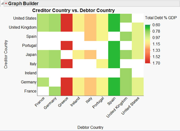
I then turned to viewing the data from the creditor country perspective. The heat map below shows which countries have loaned money to which, and it gives a view of how risky a creditor country’s portfolio is. Reading the heat map vertically, from the X axis up, it clearly shows that Greece is the riskiest debtor country, followed by Italy, Portugal and Ireland. It also shows which countries Greece owes money to. Read it horizontally to see which creditor country might be in the most trouble if Greece defaults. France and Germany have the highest risk portfolios of all the European countries.
There’s only one thing missing from the above graphs – the size of each debt owed to the creditor countries. To view that, I created a tree map in Graph Builder. The graph below shows the relative risk of each loan and the relative size of the loans.
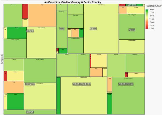
We can see that France’s portfolio not only contains risky debt, but it also is owed more by Greece and Italy than any other creditor country. Germany is next on the risk portfolio scale, but I am most concerned about Portugal, which has some Greek debt, and Spain, which has substantial Italian debt.
Looking at these graphs, you can hypothesize about how badly things might get should Greece default. Both Italy and Portugal have loaned money to Greece. If Italy were to default, Spain would most likely be next, and France and Germany would feel some severe pain. Even if Italy were able to withstand a Greek default, Portugal might not be so lucky. And if Portugal defaults, Italy would once again be vulnerable, as would Spain.
All in all, it looks pretty daunting. As of this writing, Greece has met the European Union’s requirements for spending cuts and will receive more bailout money. But will it be enough? Are other countries poised for disaster? Just yesterday, Moody's Investor Service lowered its credit ratings on Italy, Portugal and Spain.
What do you make of these graphs? Have I missed anything? Any suggestions for other ways to look at the data?
Source: http://www.bbc.co.uk/news/business-15748696
Note: You can download my JMP file from the JMP File Exchange. You need a free SAS login to access the file.

