In the past three seasons of gold, silver and silver, many domestic and foreign companies have used all kinds of solutions to make various promotiones. At the same time, they have taken the lead and competed, and spent a lot of manpower, material resources and financial resources to find employees.But the gap in demand between employers and candidates often plagues corporate HR and many candidates.Today, we will give some clues from the data level, let you refer to and explore, and use JMP's visual analysis to help both the supply and demand sides make decisions faster.
The author of this article is Xue Xue, JMP special columnist, data analysis Lovers.
Applicant vs. Employer: How to get rid of the spark of "love"?
How do applicants and employers often spark each other?I believe that everyone has their own methods, headhunting?Friend introduction?Campus Recruiting?Boss group?Vibrato? Regardless of the type of recruitment, we need a macro analysis to evaluate the results to guide future work.But boring reports and text are often easy to get lost, especially for some non-professionals.In addition, how to present fragmented information is also a major obstacle to people's rapid understanding of information. If you can find the right tools and methods to integrate as much information as possible, you can often get twice the result with half the effort.
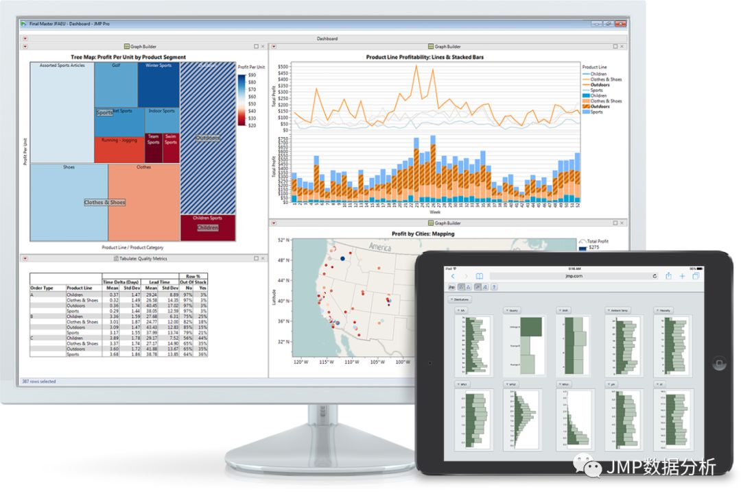
As a data analysis enthusiast, we are not hesitating to use JMP to analyze it here to see if there are any unexpected discoveries.
Do research - grab data
We selected the relevant data of an authoritative recruitment website from March to August for candidates who actively submitted resumes for a single position in a certain enterprise in Shaanxi.
According to the account province, the headers are Submit Date, Province (accounting province), and N (delivery).Next, we will use simple data processing to target the valid target data we need to analyze.Open the JMP - Table menu and select the Missing data pattern option: 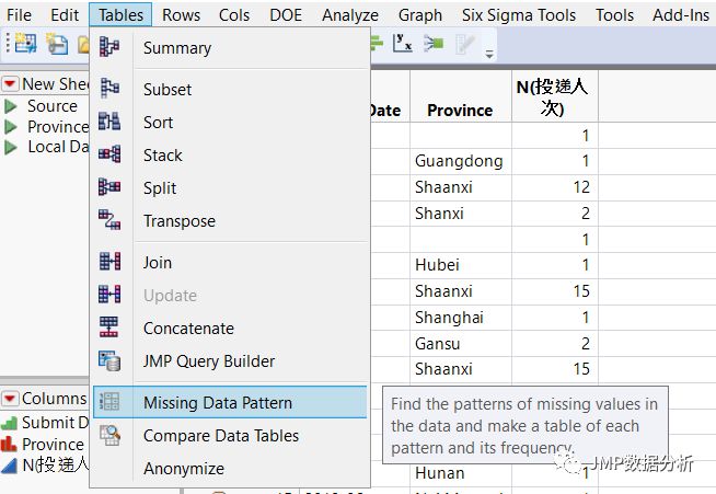
Then, select the province column in the data table:
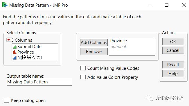 It is possible to quickly locate rows with incomplete information in the data table (limited to the missing input information of the deliverer), and then easily delete the missing rows in the original table. 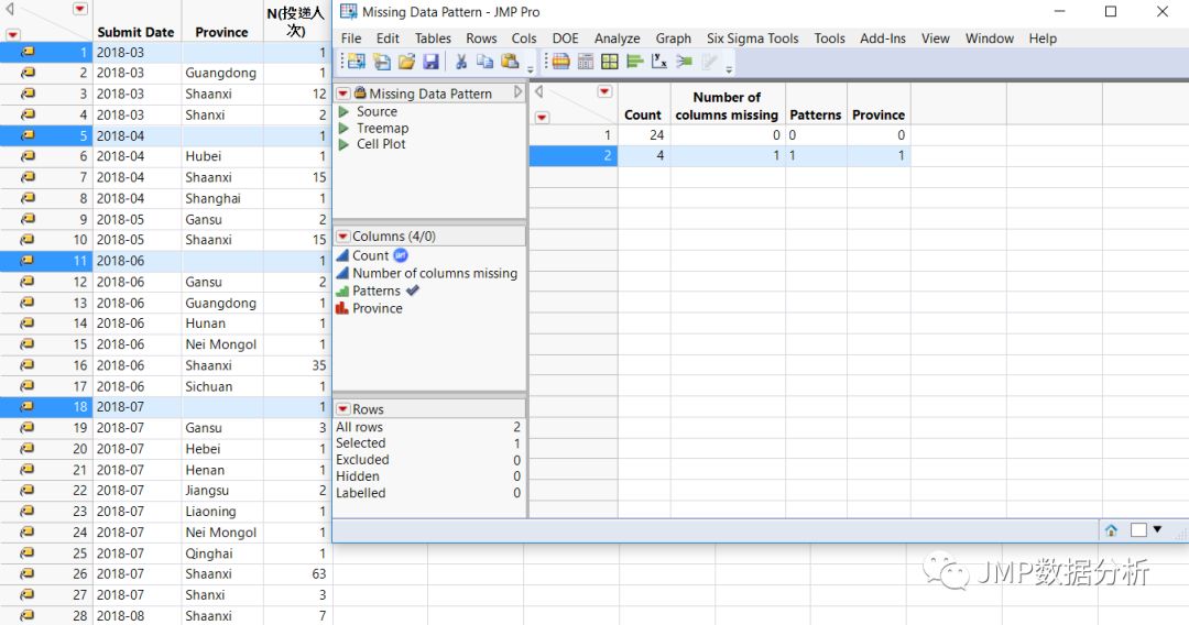 Don't underestimate this small step: when you have a lot of missing data, you can appreciate the power of this feature.Especially when we deal with censor data in reliability data.
After the above simple steps, the number of valid delivery is 173, as shown in the following table: 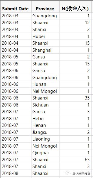
Do analysis - based on geographic location
In the JMP software, open the Graph - Graph Builder, drag the Province column in the data table to the panel according to the blue arrow, then pay attention to the circle on the left side. Use the Show missing option to present the outline of the map in mainland China as a whole. 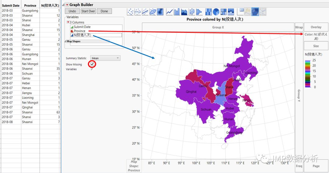 Then drag the N (delivery) column in the data table to the right color column by following the red arrow.At this point, JMP will help color the province and automatically generate a legend (the legend) to the right of the graph.Of course, the province must have a numerical value, otherwise it will still show empty white.
It is very convenient to use the JMP graphics generator to automatically map into geographic locations by province name.From the geographical location, it can be clearly seen that the candidates are mainly in the surrounding provinces, but the delivery of the purple color provinces is not high, but this is precisely the opportunity of other provinces' small partners, think about the 'blue ocean strategy'.We noticed that some of the information in the work is difficult to observe through traditional histograms, and in many cases it is inevitable that people will ignore some key information.This feature of JMP just makes up for this. 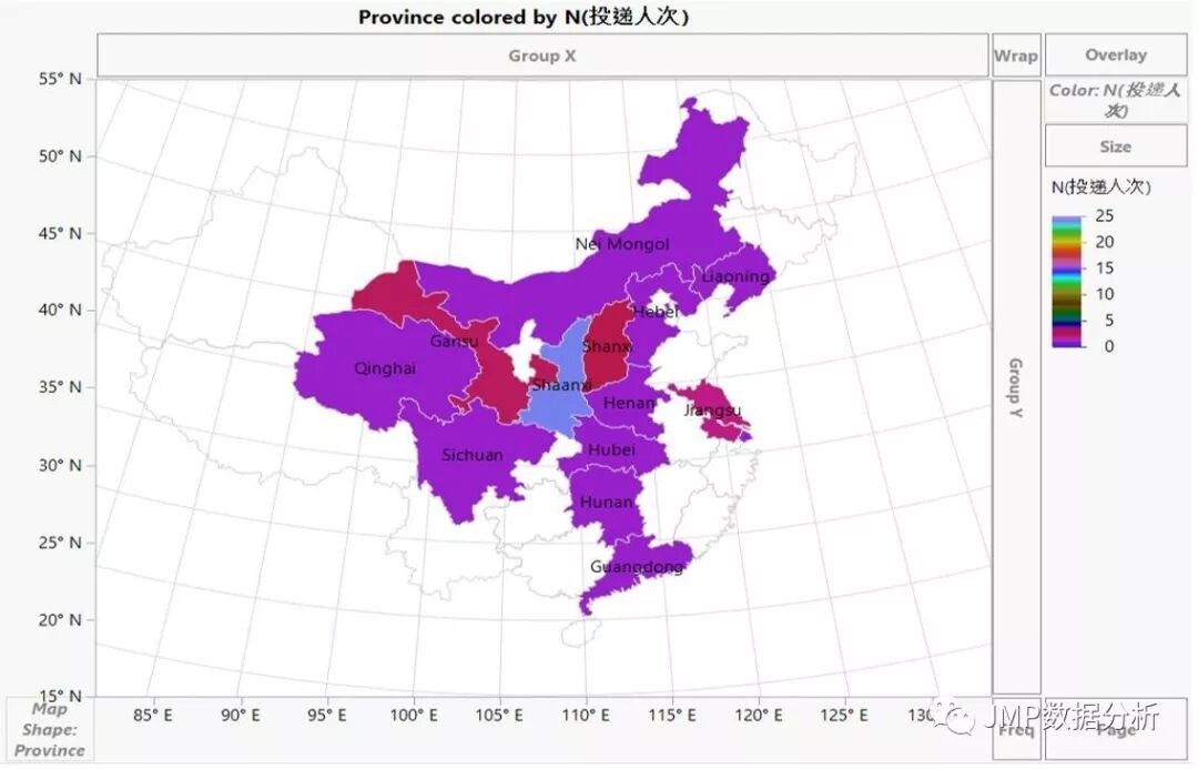
In addition, the JMP graphics generator can also support the creation of maps by yourself. Interested friends can further decompose according to the city name or place name, or view the articles we have pushed in the past:  minutes of fun data analysis> series of video (10): Easily create JMP administrative map minutes of fun data analysis> series of video (10): Easily create JMP administrative map For reference.You can also use this function to plan your own travel plans, and you can synthesize customized maps according to your own hobbies. For example, on the upcoming Dragon Boat Festival holiday, you can take a walk and go....
Do analysis - based on geographic location + dynamic timeline
In addition to the simple visualization above, we can continue to explore and discover more.
Open the red arrow to the left of the Graph builder and select Local Data Filter: 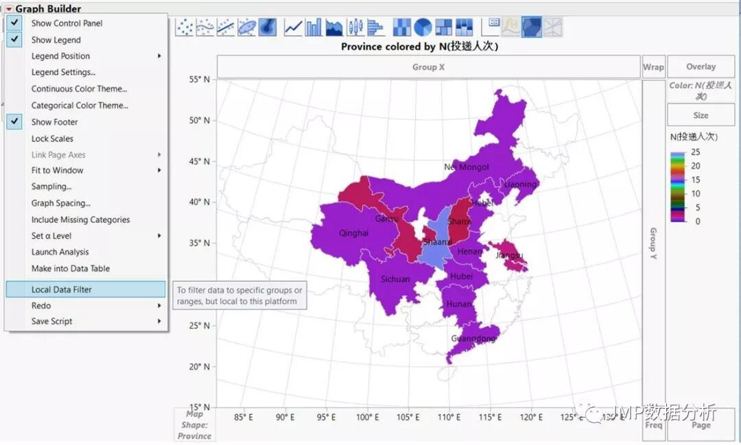
At this point, the Local Data Filter option will appear on the left, select "Submit Date" and click Add: 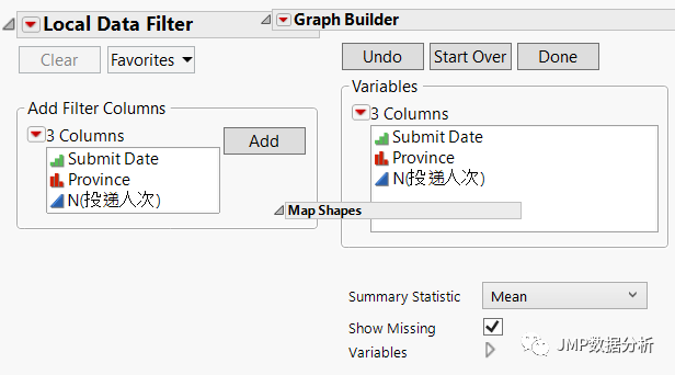
JMP will automatically split into months by month, or click the small red arrow at the top left of the local data filter: 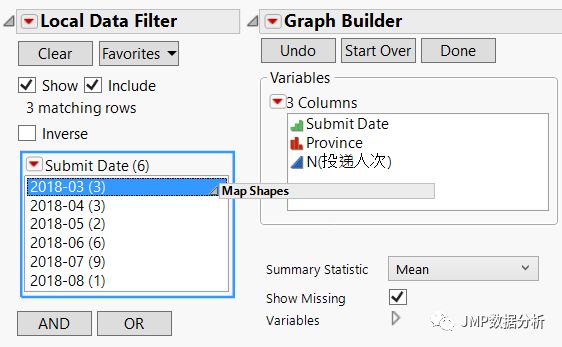
At this time, choose Animation, JMP will automatically cycle through each month (this is very useful for users who are not familiar with loop statements). 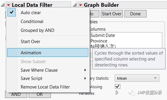
The use of JMP's dynamic local filter will further reveal the law of time according to the month. It can be seen that the number of people who delivered in the colleges in June and July is the highest, while the relative delivery in other months is relatively small.
JMP's data filters are able to quickly and efficiently present data to a specific attribute.This seemingly simple point is precisely the traditional chart.In addition, switching between different attribute values can also be displayed dynamically, eliminating the need for programming time (except for professionals).
Xiaobian has always believed that powerful and easy-to-use tools will inspire the creativity of data analysts, who are not willing to spend a long time just to implement one of their own ideas.This is like when the musicians are inspired, but there is no good paper and pen to record for him.
The dynamic generation diagram is as follows: 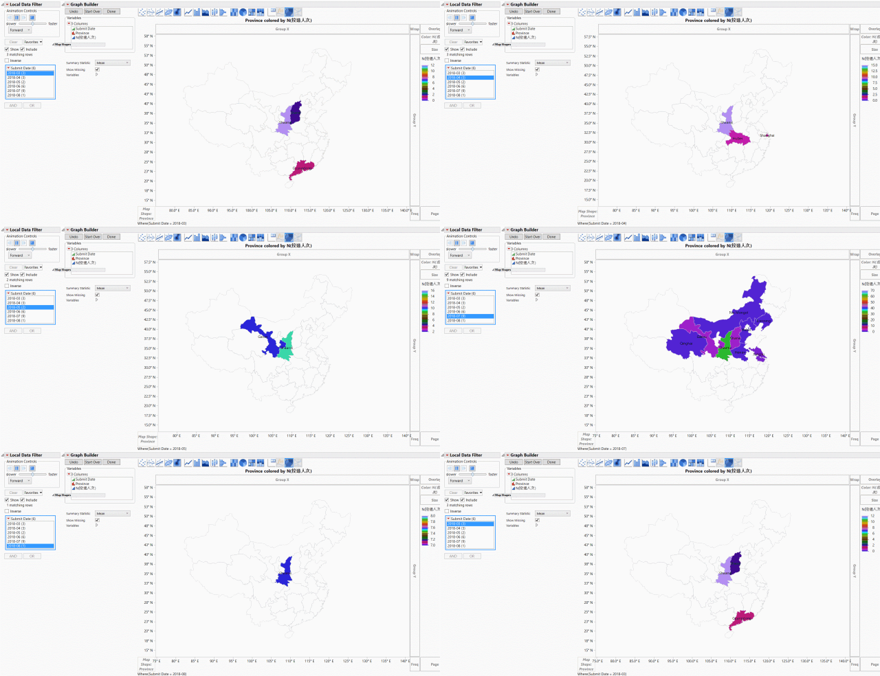
Do analysis - geolocation + dynamic timeline + more auxiliary information
In addition, we can also use the dynamic bubble chart provided by JMP to create the following effects, with the job or internship period of each position as the horizontal axis, with each province as the vertical axis, blue and red for men and women, and then for the month. As a time node, the size of the bubble represents the number of deliverers.
Organize the data table as follows (due to the length of the relationship, only part of the table is intercepted to display the header part): 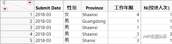 Then select the Bubble plot below the Graph and place the five different columns in the Y-axis, X-axis, ID, Time timeline and Color. 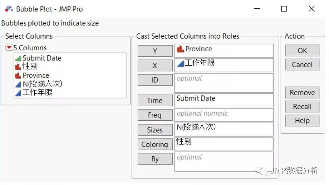 The generated bubble map can also be saved as an interactive HTML format so that it can be viewed without an JMP installation. 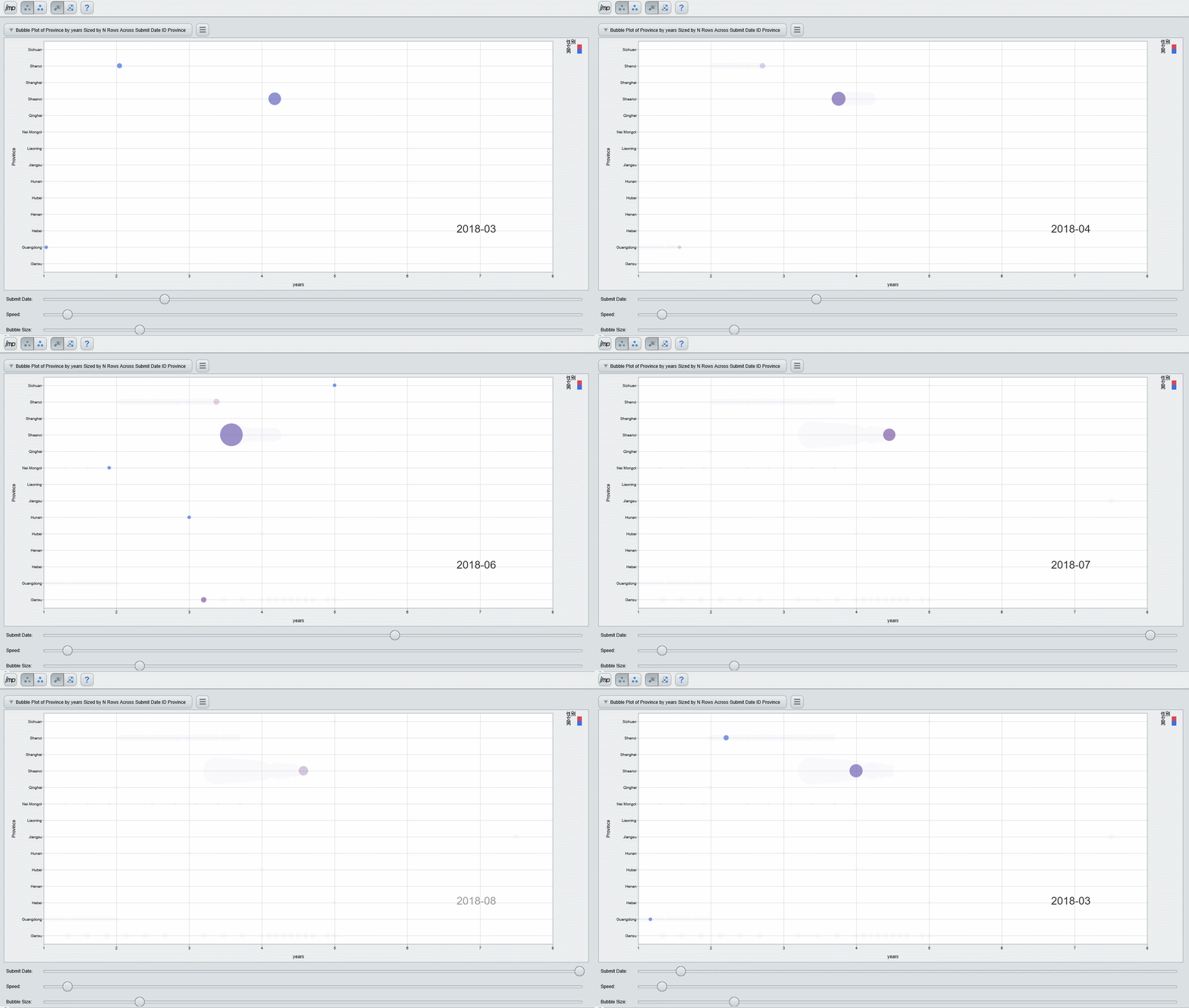
From the bubble chart you can easily find:
1
|
With the arrival of the graduation season, the number of students who have delivered students has increased relatively, and the number of experienced off-site deliverers is basically the same at this time. Therefore, for the socially experienced deliverers, the peak delivery can be considered to improve the delivery efficiency.
|
2
|
In addition, there are fewer deliverers in coastal cities. In the context of the one-on-one policy, inland cities are developing very fast, and courageous candidates may wish to focus on some inland cities with development potential.
|
3
|
Ending Eggs - It can also be found from the color. The candidates in different places are mostly men with work experience. It may be that male friends are more willing to try different places to develop their careers for career development and quality of life.
|
summary
Through the above layer analysis, we can easily find that for the applicant:
Based on the principles of the Blue Ocean Strategy, due attention should be paid to the development of some inland cities, so as to avoid the dilemma of thousands of horses crossing the single-wood bridge.
For experienced candidates, you can avoid the graduation season as appropriate, so that you can have more chances to enter the interview.
For employers:
A more diversified approach can be taken to target the delivery of non-graduate seasons.
According to the geographical location to improve the delivery volume of other provinces, of course, you can also increase the province's GDP and other information in the analysis to further find opportunities.
Of course, the above suggestions are based only on the clues provided by the data level investigated in this article. They are only for reference between the supply and demand sides, so that they can be applied and recruited more specifically. For example, they can actively prepare for the next “Golden September and Silver 10”.
If you want to experience the JMP visual analysis of the small partners, welcome " click here "Download a free 30-day trial.
Finally, if you want to be a JMP long-term columnist, welcome us to leave your profile and contact information, or send an email to Jmpmarketing@sas.com contact us.
We hope you can join!
|


